![[Experimental]](figures/lifecycle-experimental.svg)
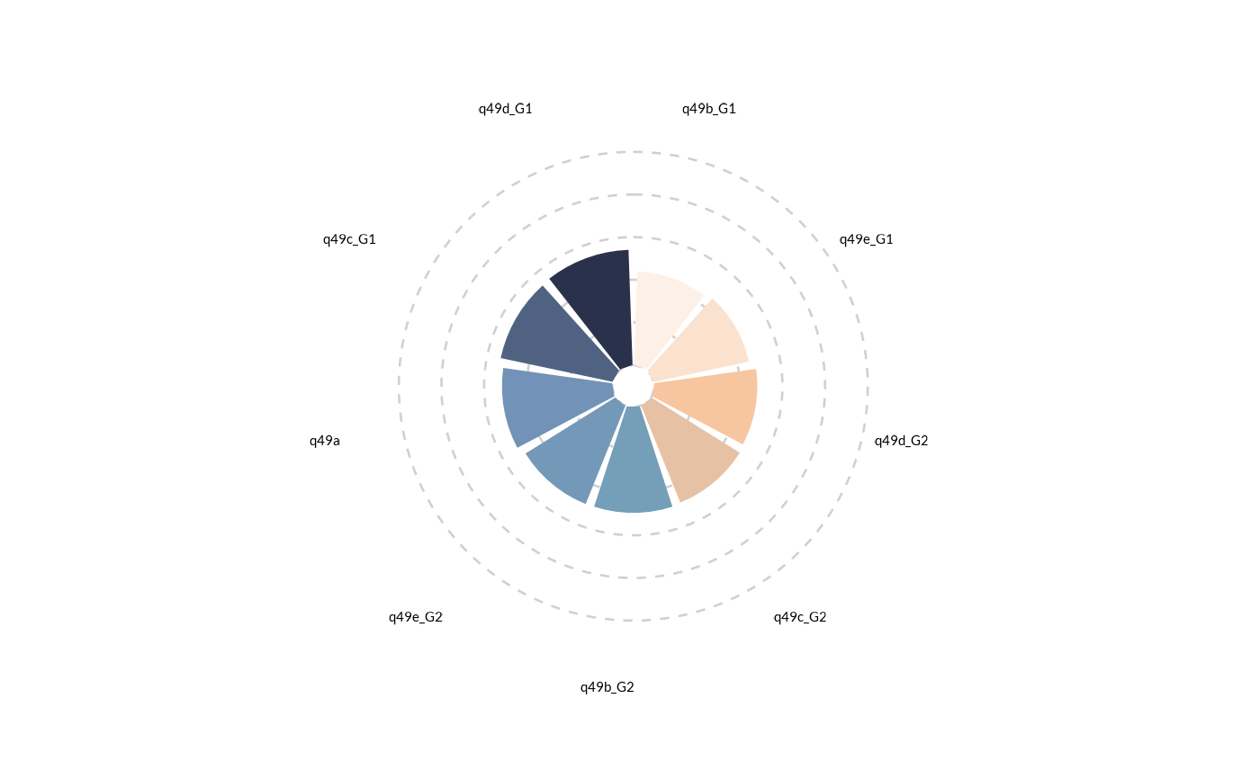
wjp_rose() takes a data frame with a specific data structure (usually long shaped) and returns a ggplot
object with a rose chart following WJP style guidelines.
Arguments
- data
A data frame containing the data to be plotted.
- target
A string specifying the variable in the data frame that contains the values to be plotted.
- grouping
A string specifying the variable in the data frame that contains the groups for the axis.
- labels
A string specifying the variable in the data frame that contains the labels to be displayed.
- cvec
A vector of colors to apply to lines.
- order_var
A string specifying the variable in the data frame that contains the display order of categories. Default is NULL.
Examples
library(dplyr)
library(tidyr)
library(haven)
library(ggplot2)

# Always load the WJP fonts (optional)
wjp_fonts()

# Preparing data
gpp_data <- WJPr::gpp

data4rose <- gpp_data %>%
select(starts_with("q49")) %>%
  mutate(
    across(
      starts_with("q49"),
      \(x) case_when(
        x <= 2  ~ 1,
        x <= 99 ~ 0
      )
    )
  ) %>%
  summarise(
    across(
      starts_with("q49"),
      \(x) mean(x, na.rm = T)*100
    )
  ) %>%
  pivot_longer(
    everything(),
    names_to  = "category",
    values_to = "percentage"
  ) %>%
  mutate(
    axis_label = category
  )

# Plotting chart
wjp_rose(
  data4rose,
  target    = "percentage",
  grouping  = "category",
  labels    = "axis_label",
  cvec      = c("#FDF1E7", "#FBE2CF", "#F7C59F",
                "#E7C1A3", "#759EB8", "#7498B8",
                "#7392B7", "#4F6281", "#2A324B")
)