![[Experimental]](figures/lifecycle-experimental.svg)
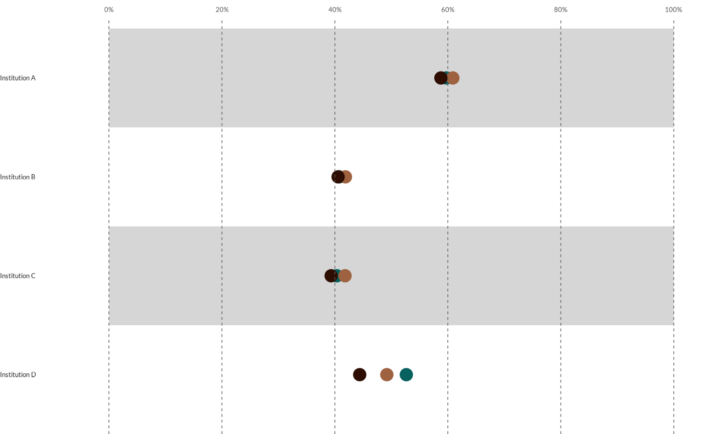
wjp_dots() takes a data frame with a specific data structure (usually long shaped) and returns a ggplot
object with a dots chart following WJP style guidelines.
Usage
wjp_dots(
  data,
  target,
  grouping,
  colors,
  cvec = NULL,
  order = NULL,
  diffOpac = FALSE,
  opacities = NULL,
  diffShp = FALSE,
  shapes = NA,
  draw_ci = FALSE,
  sd = NULL,
  sample_size = NULL,
  bgcolor = "#ffffff",
  ptheme = WJP_theme()
)
Arguments
- data
Data frame containing the data to plot
- target
String. Column name of the variable that will supply the values to plot.
- grouping
String. Column name of the variable that supplies the Y-Axis labels to show in the plot.
- colors
String. Column name of the variable that supplies the grouping values. The plot will show a different color per group.
- cvec
Named vector with the colors to apply to the dots. Default is NULL.
- order
String. Column name of the variable that contains the custom order for the labels.
- diffOpac
Boolean. If TRUE, the plot will expect different levels of opacities for the dots. Default is FALSE.
- opacities
Named vector with the opacity levels to apply to the dots. Default is NULL.
- diffShp
Boolean. If TRUE, the plot will expect different shapes for the dots. Default is FALSE.
- shapes
Named vector with shapes to be displayed. Default is NULL.
- draw_ci
Boolean. If TRUE, will draw a binomial confidence interval with target value as parameter of interest.
- sd
String. Column name of the variable that supplies the standard error for drawing confidence intervals.
- sample_size
String. Column name of the variable that supplies the number of observations for drawing confidence intervals.
- bgcolor
String. Hex code for the "white" background in the strips.
- ptheme
ggplot theme function to apply to the plot. By default, function applies WJP_theme().
Examples
library(dplyr)
library(tidyr)
library(haven)
library(ggplot2)

# Always load the WJP fonts if not passing a custom theme to function
wjp_fonts()

# Preparing data
gpp_data <- WJPr::gpp

# Preparing data
data4dots <- gpp_data %>%
  select(country, q1a, q1b, q1c, q1d) %>%
  mutate(
    across(
      !country,
      \(x) case_when(
        x <= 2 ~ 1,
        x <= 4 ~ 0
      )
    )
  ) %>%
  group_by(country) %>%
  summarise(
    across(
      everything(),
      \(x) mean(x, na.rm = T)*100
    ),
    .groups = "keep"
  ) %>%
  pivot_longer(
    !country,
    names_to  = "variable",
    values_to = "percentage"
  ) %>%
  mutate(
    institution = case_when(
      variable == "q1a" ~ "Institution A",
      variable == "q1b" ~ "Institution B",
      variable == "q1c" ~ "Institution C",
      variable == "q1d" ~ "Institution D",
    )
  )

# Plotting chart
wjp_dots(
  data4dots,
  target      = "percentage",
  grouping    = "institution",
  colors      = "country",
  cvec        = c("Atlantis"  = "#08605F",
                  "Narnia"    = "#9E6240",
                  "Neverland" = "#2E0E02")
)